The Advantages of Using Vector Fonts
There are a great many different image options – and different file formats – available for any designer to work with, so it can be a little bit overwhelming when you have to choose which one to use, especially if you will be sending your finished work to a client.
Compatibility is certainly something to be concerned about, however, whenever you are working with graphic and images, especially text and fonts it is far more important to be concerned about just how those images are going to render.
There are two basic types of digital graphics files to choose from, vector and raster. Vector images are comprised of thousands, actually hundreds of thousands, of minute lines and curves that are put together to form an image. On the other hand, raster images are made up of a myriad of pixels. So which format is best for your particular project?
Vector images have their basic roots in mathematics and mathematical theories. They need to be created in a software program that has been written to be able to handle these intricate, wireframe like images.
Perhaps one of the most common uses for vector images is in text, as vector fonts. The great advantage of a vector font is that it can, because of its unique makeup, be scaled and re-sized almost endlessly, and yet it will never begin to look fuzzy, cloudy or pixelated.
It is easy to identify a vector font if you look closely at the edges of each letter. In the case of a vector based font, no matter how far you zoom in it will always appear to be smooth. The reverse is also true. No matter how many points bigger you make your text the quality will never degrade.
Vector fonts are almost always a designer’s best option when creating an illustration or a logo, because of their great flexibility. Sure, you – or your client – may only need a small version of a logo right now, for a business card perhaps, but wouldn’t it be best if that logo used text that can be easily enlarged when it needs to be used for a different purpose, maybe for use on a larger banner or poster?
Usually another advantage of using vector images and vector fonts is that they are more efficient in terms of file size. As they are identified using mathematical descriptions and not thousands of little pixels the files are usually much smaller than their raster rendered counterparts, something that makes transmitting them across the Internet and from device to device much easier.
The only problem that some people do encounter when using vector based images and vector based fonts is that compatibility issue. Often a designer will create their work in a program like Adobe Illustrator and output the native files it creates, which a person who does not own that program will not be able to open.
Widely compatible formats do exist though; you just have to know what they are and how to use them. For example, the common wisdom is that a vector based font will not render properly from Adobe Photoshop, as that is raster based software that will flatten the vector image as it saves it.
Now, using Photoshop to create a text heavy layout is not ideal, as it really is not a page layout program at all. However, many people enjoy using the program and some print shops will insist upon being given a PSD file to print from. If that is the case, saving the work that contains vector fonts as a “Photoshop PDF”, and making sure to check the boxes that say ‘Include Vector Data’ and ‘Embed fonts’ will maintain the vector quality of your fonts while still producing a file that almost everyone can work with.
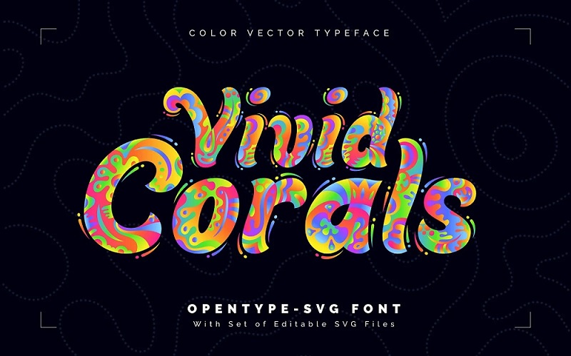
Vivid Corals — Color Vector Font
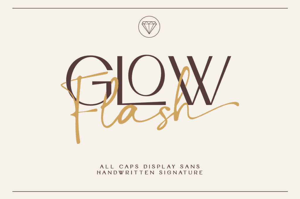
Glow Flash – Luxury Vector Font Duo
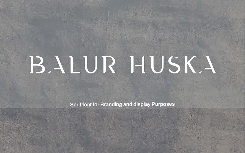
Balur Huska – Vector Luxury Font
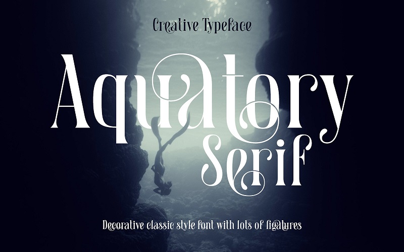
Aquatory Vector Serif Font
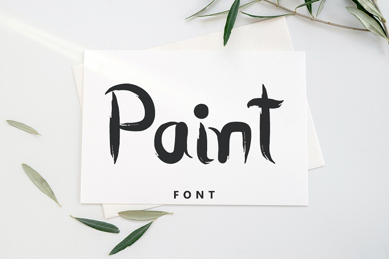
Paint – Special Minimal Vector Font


Olivier
July 18, 2013I have just learned something. Thanks !