Designing Emails: Process and Inspiration
Emails are an important part of business outreach strategy. Monetizing the use of emails by making them part of business marketing strategy is quite common, but what is uncommon is emails delivering the returns you are looking for. There are quite a number of online marketing experts who believe businesses mustn’t chase returns from email marketing because they are elusive at best and the effort doesn’t justify the final outcome. As a designer, I have my own take on why not all email campaigns generate revenue.
I believe the design of emails or the lack of it is the reason behind their failure to make an impression on the recipient. With RWD emerging as the next big thing, and with designers getting caught up in the merits or demerits of minimalist design, flat design, etc., not many designers are willing to give the time and the effort required to create well-designed emails. That’s because even businesses don’t believe in investing time and effort in creating engaging, top-of-the line HTML emails.
This article is for those who still think emails are an important marketing channel and also for the unbelievers. Following a staged designing process for an email, which is actually a set of simple newsletter design tips, you will be able to create an email in no time at all.
Let’s take a look at a few important aspects that are a part of the email designing process:
First Things First, Sort Out Your Thoughts
Begin by figuring out how you want your email ook like. Adopt the same kind of thinking as you would, while designing a web page. There isn’t a lot of difference between the two. Also make sure your design is simple and straightforward; the reason for creating a simple email is that you want it to work with all email clients, even those with poor standard support. While designing your email, make sure every single design element you use renders effectively on all email clients.
Create a Graphical Mockup of the Template
Before you begin the actual process of design, be sure to create a mockup of your email template. The mockup must look exactly like the final template, so that your client gets an idea of what the final design will look like. Most clients, who take an interest in the way their projects are designed, want their project to shape up in perfect conformity with their project brief. If your mockup is good, you will be given the go-ahead for actual design, but if it lacks in certain aspects, the client will provide the necessary feedback. In this case, make the necessary changes in the mockup, and then begin designing the email template.
Ensure You Use Tables for Layout
Given the fact that there are plenty of email clients that don’t support designing techniques like padding, margin, etc., you must play it safe and use tables. But while doing so make sure that you don’t set the width for the table, but for each cell in the table.
Now there are some designers who assume that email clients will figure out a width out for themselves if they don’t mention a specific width, but that’s not going to happen. Also, some email clients put in their own values, which can lead to your design breaking up. So, make sure you specify them.
Images, Inline Styles and Shortcodes
Your HTML email template will have images, but if you embed images in it, it’s going to get very heavy and put a load on the server. So, the trick here is to use images that are hosted on your own server and include them in an email using an absolute path. We will discuss other aspects of the use of images later in the article.
Defining Paragraphs
You also need to ensure consistent paragraph spacing across all email clients, and for this to happen you need to set the margin inline. Do this through CSS and you will get the kind of consistent paragraph spacing you want.
At times, your design could be height-sensitive, in which case you will need to use table nesting or cell padding for setting the text formatting inline in the table cell itself.
Using Images
There are few pointers you must keep in mind while using images in your email template design:
- Limit your use of images as much as possible, and make sure your important content is not displayed through the use of images.
- Don’t use spacer images and nested tables, but focus on fixed cells widths so that even if your images are stripped by the email clients, your formatting won’t go haywire.
- Make sure that you don’t forget to size your images before placing them in your layout and also mention their dimensions in the code. If you don’t mention the dimension, email clients will assume their own dimension, which might break your layout.
- Say no to PNG and yes to GIF or JPG formats for the images used in the email. Most email clients support GIF or JPG formats.
Don’t Go Wider Than 660px
If you go beyond this width, there is a chance that only a part of your email will be displayed. If you are coding your emails for mobile email clients, then the width must be less than 600 pixels. This ensures that even if your emails width is scaled down, the design will still render effectively on most devices. Let’s say, anything between 300px and 500px will be a good width.
By keeping these aspects in mind you will be able to design an email that subscribes to the best practices of email design. But mind you, the technicalities of designing an email are definitely important, but you must not forget creating content that is impressive and engaging. The words that you use and the images that you choose must be able to convey the message in a way that appeals instantly to recipients.
Before we end, here are a few well-designed HTML email templates for your inspiration:
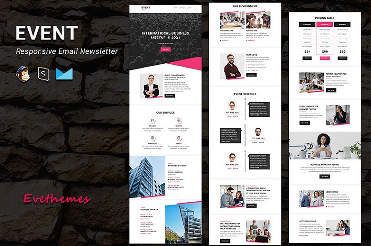
Event – Responsive Email Newsletter Template
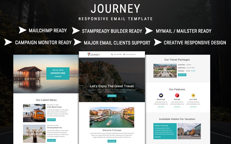
Journey – Email Newsletter Template
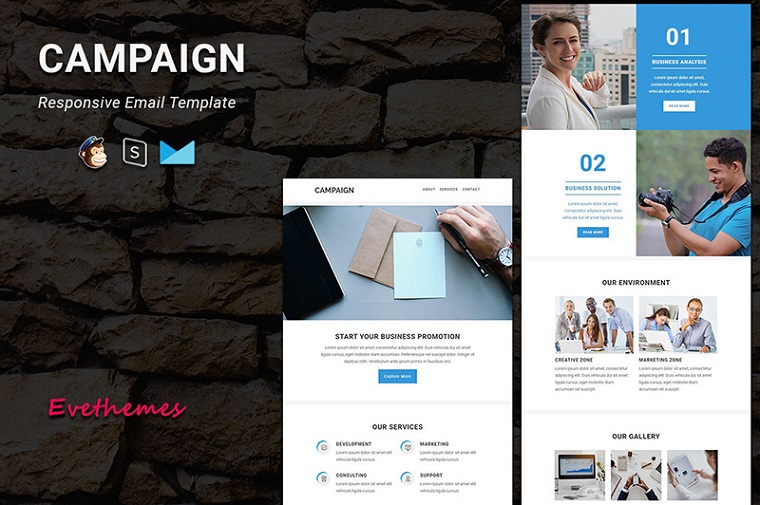
Campaign – Responsive Email Newsletter Template
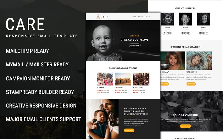
Care – Email Newsletter Template
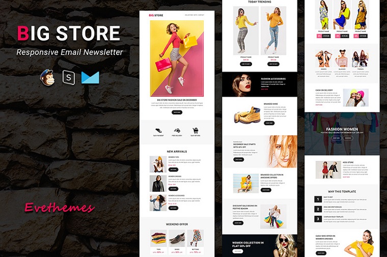
Big Store – Responsive Email Newsletter Template
