Negative Space Logos. Drawing Less – Telling More…
Developers dealing with logo design know quite well how challenging it can be. Customers want their finished logo aka brand identity to be like a catchy tune people can’t get rid of even if they’ve heard it only once. Every now and then, they find themselves humming this simple melody doing the routine work. They want to stop, but it’s too late, the tune got stuck in their convolutions. Common situation, isn’t it?
A good logo should work similar to such intrusive melodies. Seeing it once, people should easily memorize it and then recognize among numerous competitors. Short capacious names, simple shapes and not many colors work best for the purpose.
As you see, logo designers are really pent up in the methods of expression, which extraordinarily complicates the task. It’s not a problem to combine primitive images with short words, of course, but this can’t be considered a solution. Logos are pieces of art, taking special place in the sphere of graphic design. The kernel of the whole matter is that a logo should contain a quintessence of company services, concepts and ideas. Too much for one small design item? Not at all, many expert professionals find the way to cram the extraordinarily sophisticated thoughts into the compact logo design area.
We have already mentioned the involvement of negative space into logo design. The technique is one of the possible options to render deeper meaning through common things. Actually, the method helps to ‘kill two birds with one stone’. Designers reach utmost simplicity, accuracy and clearance simultaneously conveying the most complex company ideas, which sometimes contain a kind of riddles or optical illusions, raising customer’s interest.
In case you would like to specify what we mean by the term negative space, let’s fresh it up in our memory. Negative or white space is all space around and between the letters and images of your design. In simple words, it is a background area, over which all other elements are placed. Of course, negative space is very important at logo design. The developer carefully selects its hue to match the content and make the objects stand out better. But negative space is capable of more than just being a perfect background for something more important. Sometimes, negative space around the object (but not the object itself) forms an artistic shape, which in its turn, is used as a real image. The effect enormously increases user’s interest and negative space logos’ appeal in general.
Herein under we are going to showcase some striking negative space logos, the authors of which were able to tame the idle white space and make it an active participant of the whole design performance. Just agree that all those genius logos would become trivial without the magic touch of negative space component.
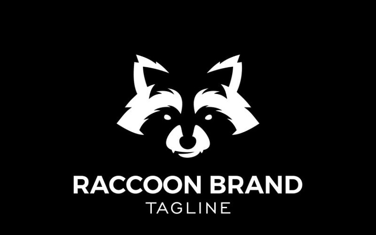
Raccoon Logo Template

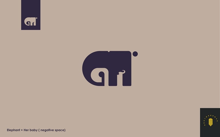
Elephant and Her Baby Into Negative Space Logo Template

Tech Unicorn Gradient Emblem Logo

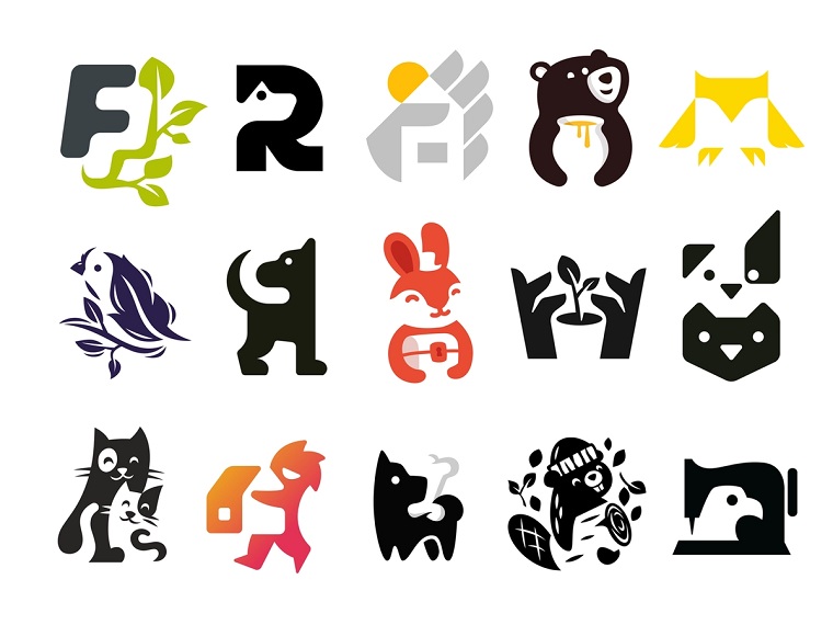
Owl Negative Space Logo Template

Negative space logos

Negative Space Logo

Air Travel Logo

Rocket with Chat Gradient Logo

Negative Space Logo Design

Weapons Negative Space Logo


