The Art of Contrast – Clashing Color Schemes in Website Designs
What catches your eye first when you are opening the website? Of course impressive design in which color contrast plays one of the main parts. Contrast is the secret spice which gives your web project the special touch of uniqueness and individuality. But color contrast is not just the designer tip, it’s also an important tool which should make the page accessible and usable for all visitors. The main principle of the contrast is the visible difference between two or more colors that makes the outstanding effect on the website. The method of clashing color scheme will be really helpful in separation of the header, content area and footer. Actually you can play with the contrast as much as you want, creating new schemes and combinations which will suit your project. But remember that contrast is the special art which demands designer’s skills and good taste. So while choosing the appropriate color contrast theme for your website, it’s quite important to keep in mind all these principles.
Today we offer you the great selection of website templates which are made with effective color contrast design. So check out and use them in creation of your best web projects!
Spektive – Legible And Neat Material Design WordPress Theme

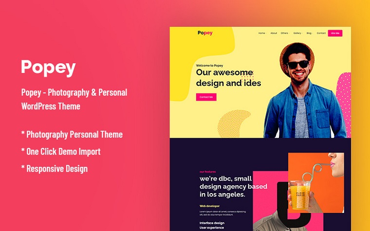
Popey – Personal & CV Responsive WordPress Theme

Edugrow – Preschool WordPress Theme

Tempores – Street Dance WordPress Elementor Theme

Rajha – Indian Restaurant WordPress Theme

Aventer | Conferences & Events WordPress Theme

Eventes – Conference and Event WordPress Theme


Online Coupon Codes
March 28, 2012Looking nice. I like above designs and im going to use it. Thanks fro sharing.
London escorts
March 29, 2012Designs are really great and they can be able to use for different topics of sites.