Medical Colors – Why Color Matters in Healthcare Design
Usually, the aesthetics and medical colors are overly practical and focus more on being hygienic and harmless, than on the need to create a healing and eye-pleasing environment.
Somehow too often we forget about color and its power, especially when it comes to the healthcare industry. People visit hospitals and medical centers when they are sick, traumatized, and anxious. That`s why in this article we will reveal some insights on colors for medical websites and interior design.
“Variety of form and brilliancy of color are actual means of recovery “
Florence Nightingale
How to Create a Pleasing Medical Environment with Colors
We all know that our perception of a place changes when we change colors. Hue can make us feel a space larger, cleaner, warmer, and more pleasant.
Increasingly, hospital and healthcare leaders are recognizing the color and its uses for soothing, healing, and, in general, providing patients, staff, and visitors with a more pleasant experience in healthcare settings.
When designing healthcare facilities, designers should take into account the difference between the departments of clinics and hospitals. This includes medical “work” areas used for diagnosis and treatment, recovery areas such as wards and recovery areas, and waiting rooms, canteens, and corridors.
Corridors, restaurants, and waiting areas are the best places for bold designs and lively patterns, as people won’t stay here for too long. Giving places a clear visual identity helps visitors find their way easier, so vibrant colors and patterns can be really important in orienting people in a hospital. However, overly saturated color, high-contrast patterns, and graphics can be overly exciting and should therefore be used with caution.
The addition of biophilic design, natural materials, and natural light to these areas has been shown to have physical and psychological benefits that can help reduce stress and anxiety and improve air quality. In the treatment and diagnostic areas, it is necessary to use soothing colors and their combinations. In this case, muted pastels and neutrals work well. Doctors often use the patient’s skin tone when assessing, so bright colors should be avoided, like the latter, due to the color reflecting on the skin, which can lead to misdiagnosis.

The influence of design can be achieved by highlighting characteristic details such as sinks or windows. Patients who have a window in their ward, from which trees are visible, recover faster than those who do not. This reinforces the idea of the benefits of working with nature in healthcare settings.
Medical Colors in Web and Interior Design with Examples
There are several color options to avoid when designing healthcare facilities.
Blue and White Medical Colors

The blue color is associated with nobility, trust, and cleanness. Therefore, it is a perfect color for high-rate medical clinics. However, you should remember, that blue is a cold color, which should be combined and balanced with some warm hues.
Turquoise and Green

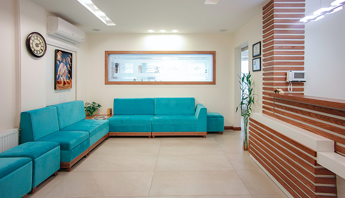
Green is calming. However, too much green can irritate. Try to use it as an accent color, or replace it with some color mixes, e.g. turquoise. A good example of fertility agency design is https://www.eggdonors.asia/. They combine turquoise and yellow.
Orange Medical Color

Orange is a mentally stimulating color and is therefore avoided in large quantities in psychiatric settings as it can heighten emotional states.
Red

The color red is known to increase blood pressure and is also associated with blood, which is why it is not used in cardiology or surgery.
Yellow

In neonatal and maternity wards, the color yellow should be avoided as it not only makes babies cry more but also makes it difficult to detect jaundice. As for the websites, yellow looks great on psychology websites like this one https://psy4future.com.ua/, health consultant projects.


