Routine Becomes Miracle: Carl Warner’s Foodscapes and Otherscapes
Each human today is usually so immersed in the everyday routine, that he can hardly see further the nose (if speaking metaphorically). There are so many things we met all the time, that can become a miracle. The problem is we don’t pay much attention to them considering as just another part of everydayness.
For example, let’s take food. What do we have today? People are in hurry, people push pieces in their mouths while watching TV’s, talking with each other and sitting before their monitors. They can’t simply take some time and enjoy the food itself for a while. So, I’m not even talking about artistic perception of this inevitable part of human life. But there is another person, who doesn’t only talk, but also demonstrates. I mean Carl Warner and his wonderful foodscapes.
Carl began his career from regular ads photography. Then he understood he was doing something not needed for him personally: and the period of creative wanderings began. In result in ended in foodscape compositions. In them we can see a strong influence of surrealistic Dali (Carl did love him in his childhood). The author could create an atmosphere of fabulousness using just food elements. Interested? Well, let me present you the most beautiful and creative examples of foodscapes.
Tuscan Market
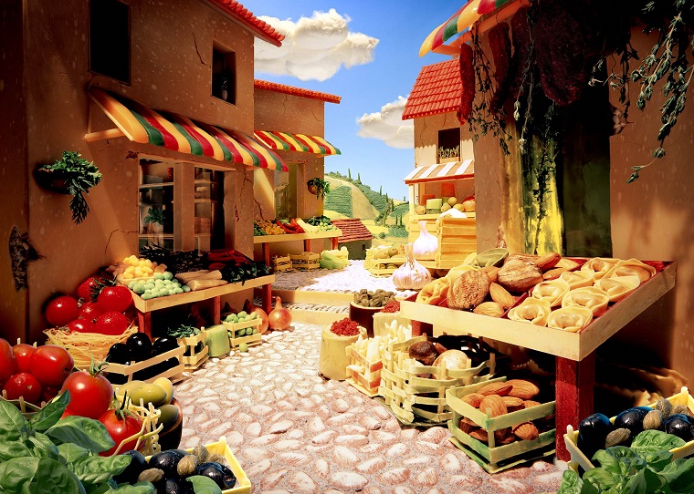
Tuscan Landscape
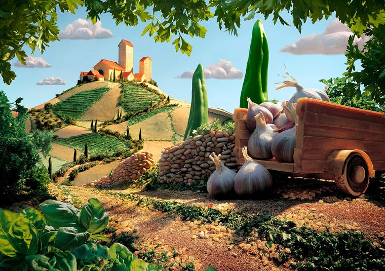
Wheat Thins Kraken
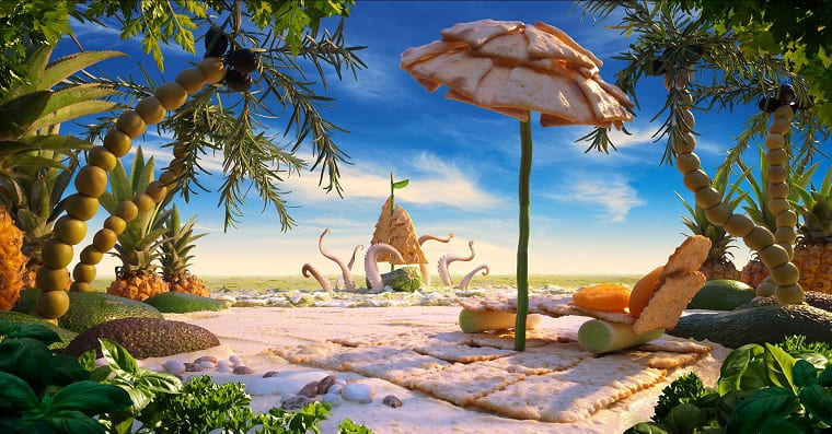
The Global Farm of the Future
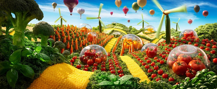
Broccoli Forest
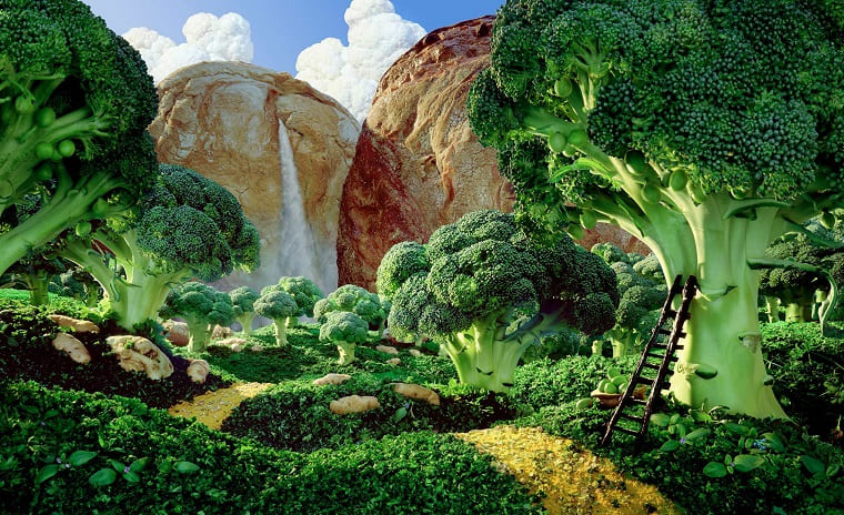
Breadscape
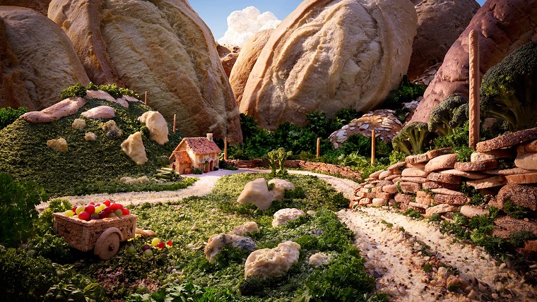
Fujiscape
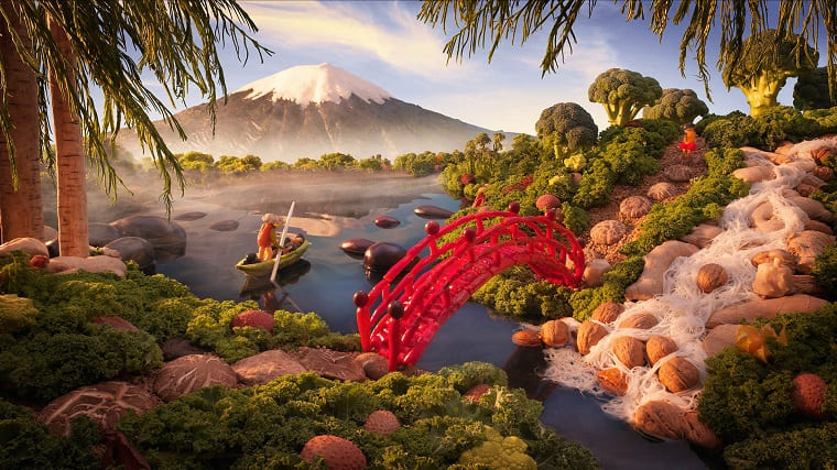
Salmon Sea
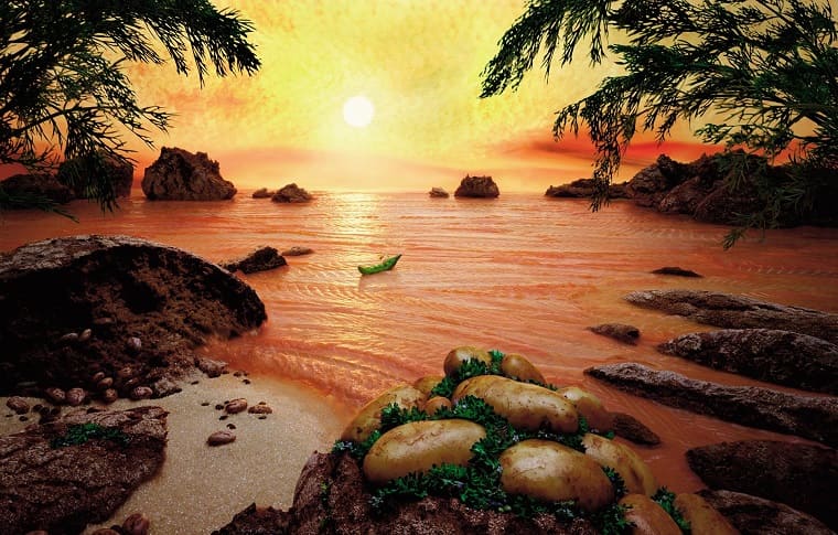
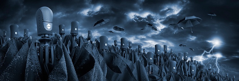
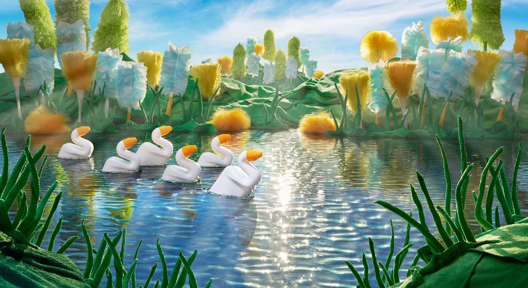
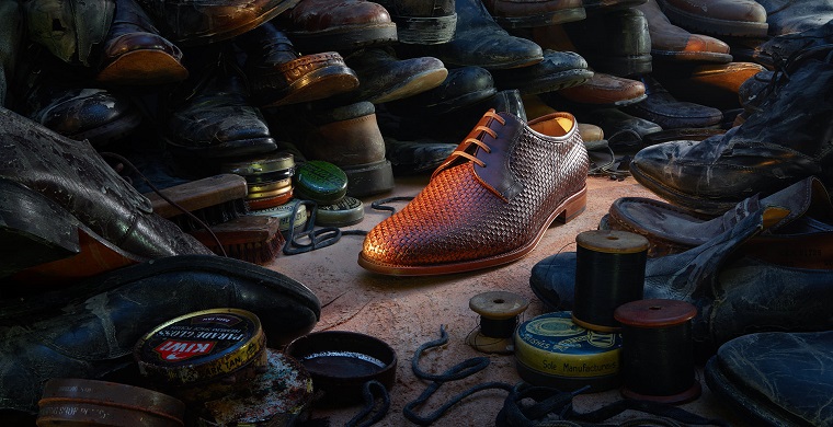
Happy to mention, the food haven’t become the monopolist in Mr. Warner’s art, so we can also enjoy other compositions. They keep the unique style of foodscapes, nevertheless the elements are different from the food products: we can watch human bodies, household stuff, clothes and other. Yes, exactly “other” – the author called this series of creations otherscapes. And I present the most impressive examples below.
VW City

Scented Sky

Storm Troopers
Duck Pond
Lost Soles
Tigota – Razor Field

Carl Warner’s art is a living example of how the professional and high-quality advertising art should look like. He has experience and talent to implement such original ideas as foodscapes and otherscapes into life. So, are you worse than Carl? Just take inspiration from the listed works, kill your lazyness and create something even more attractive.
However, if you don’t agree with my opinion and think the foodscapes and otherscapes are not worth of a creative advertiser’s attention, I will be glad to read your arguments in the comments.


